1983

Background
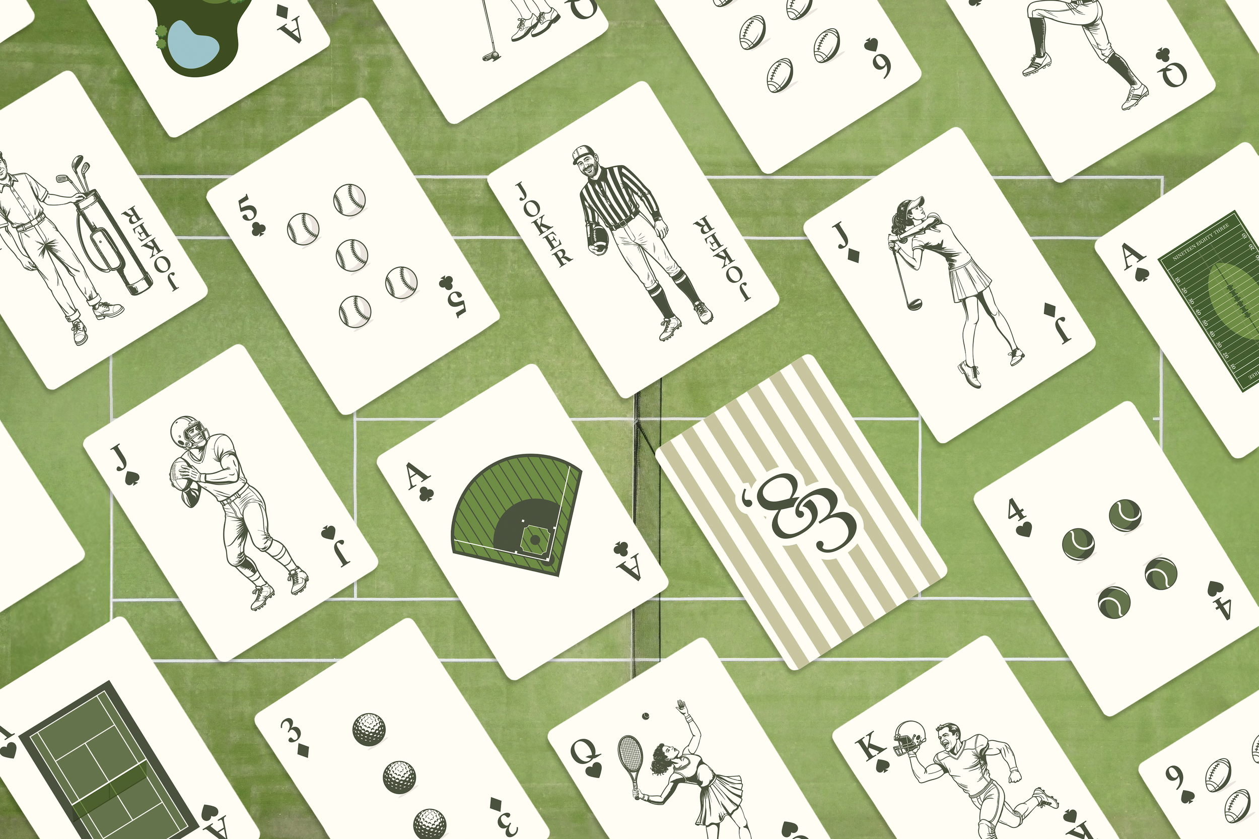
1983 is a sports bar, restaurant, and arcade designed to evoke a nostalgic country club feel. With elevated comfort food, craft cocktails, and classic arcade games, 1983 offers a playful yet refined setting. Whether you’re catching the big game, enjoying a casual dinner, or unwinding with friends over drinks and games, 1983 delivers a retro-inspired experience with a modern twist.
THE ASK
Create a fresh brand identity for 1983 that reflects its retro country club style, combining a classic sports bar atmosphere with elevated comfort food and arcade fun.
THE Challenge
Balance nostalgia and sophistication by giving 1983 a polished, approachable feel while keeping the playful, retro character.
THE Solution
Develop a brand identity using retro-inspired color palettes, refined typography, and clean layouts, creating a cohesive, elevated look across menus, signage, digital touchpoints, and arcade elements.
Primary Logo
A clean typographic logo that uses stylized numerals. Its simple design works well across different brand materials.
Secondary Logo
A crest-style logo that includes typography, a checkered pattern, and a cocktail illustration. It blends classic and casual elements to reflect the brand’s personality.
Alternative Logo
An illustrated martini glass with a small flag detail. This version highlights the brand’s social and lively side in a fun, approachable way.
Icons
Small illustrated icons used to promote events and support branding. They draw on country club aesthetics and timeless vintage style, adding a subtle, refined touch across materials.